Thursday 20 May 2010

Typography


Our habit was ear rubbing. It is associated with a person not paying attention and losing interest. We looked at a lot of different drink labels and we were interested in the way barcodes operate. We came up with our own barcode symbology that when read correctly tells the consumer exactly what they are purchasing. If they have to decode it then they are most likely going to pay attention to what is going on.


Each letter and number is represent by no more than four bars.


For the letters, the first bar continuously increases by one point size in alpha accession. The number of bars increase and descend accordingly following a simple pattern.


For the digits, the bars are a quarter shorter than the letter bars. The thicker bar is now the last bar in accession. The number of bars increase and ascend accordingly still following a simple pattern.


Code 116 stands for the initials of the creators, 1 for the letter A and 16 for the letter P.


Sunday 9 May 2010

University promotion

We want to show the different disciplines of Kingston University’s Knight’s Park campus in a way that would entice viewers to take a closer look.

Our idea was called “Art Tribes”, we found how the faculties here at Knights Park are like tribes in a way, with each specializing in a particular field. from there we did a mash -up of different disciplines thereby creating artefacts that ring true to the campus as a whole. However We thought it would be interesting to display this in a museum like fashion,.


The stool was crafted using paintbrush handles and measuring tape, giving the product and 3d design areas a twist.


The garment, which obviously has to do with fashion, was constructed out of planning paper, which architecture and interior designers use. We combined elements of photography with it as well.


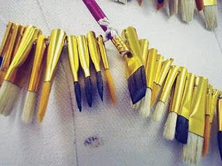
The necklace was made out of paintbrush heads and handles, we wanted it to look ceremonial the way the Egyptian and Native American neckpieces did.